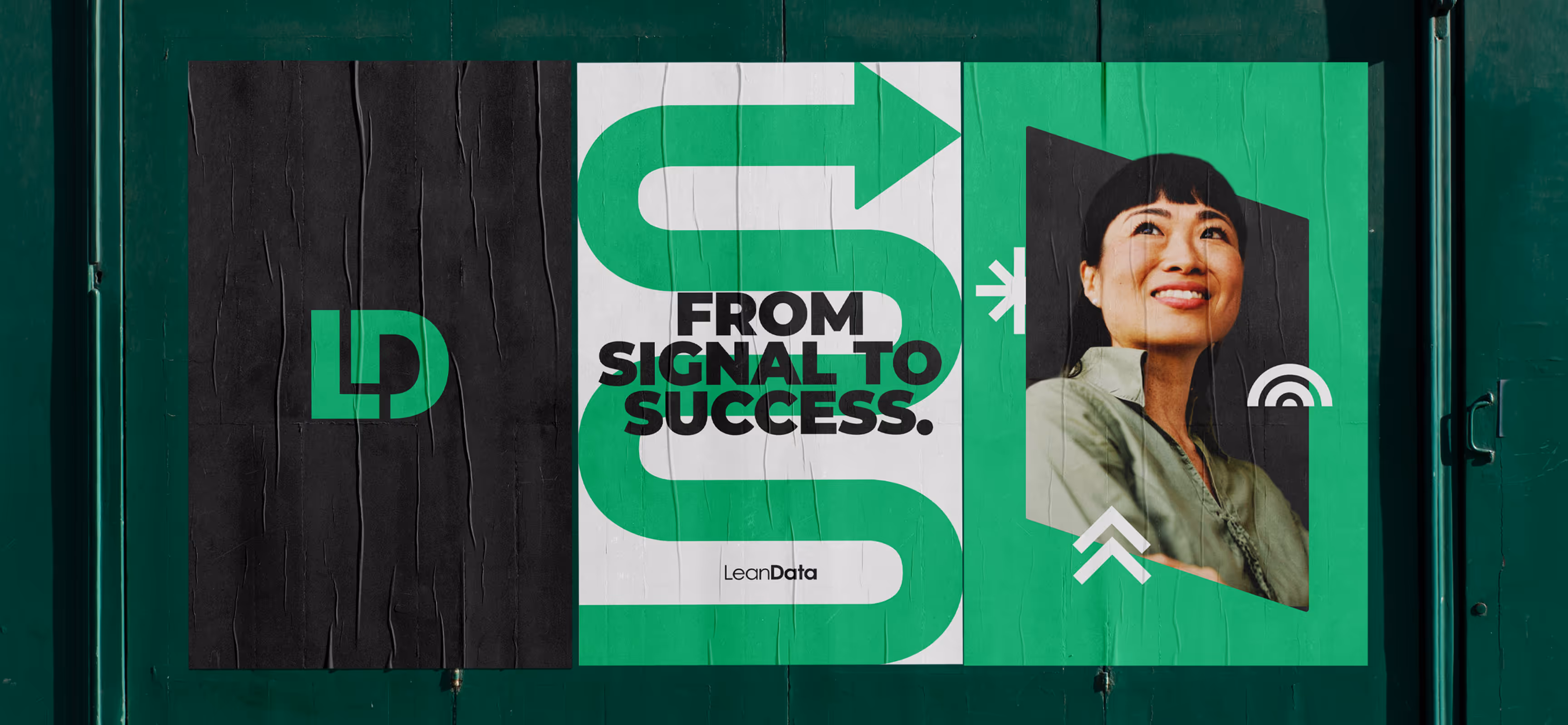
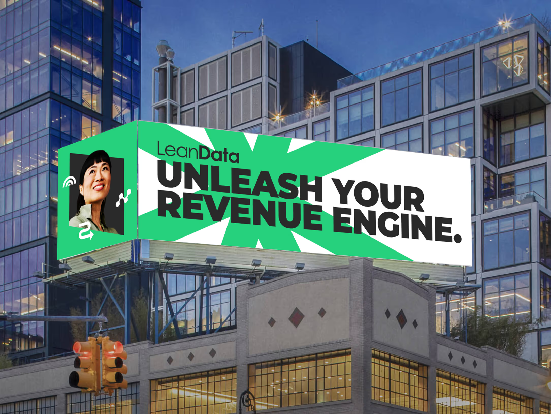
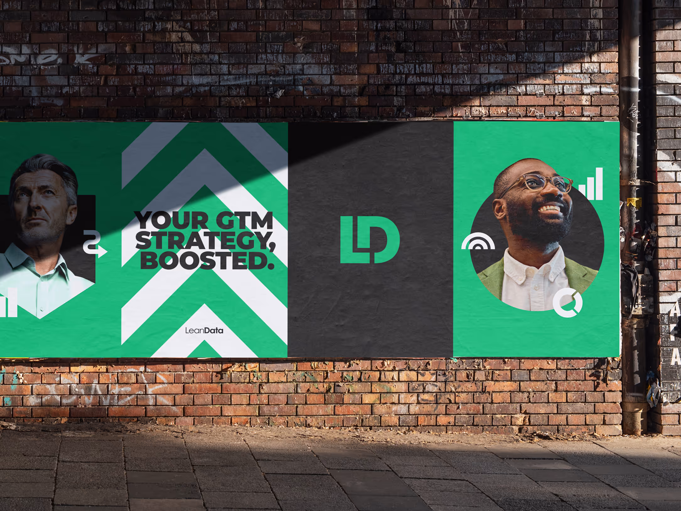
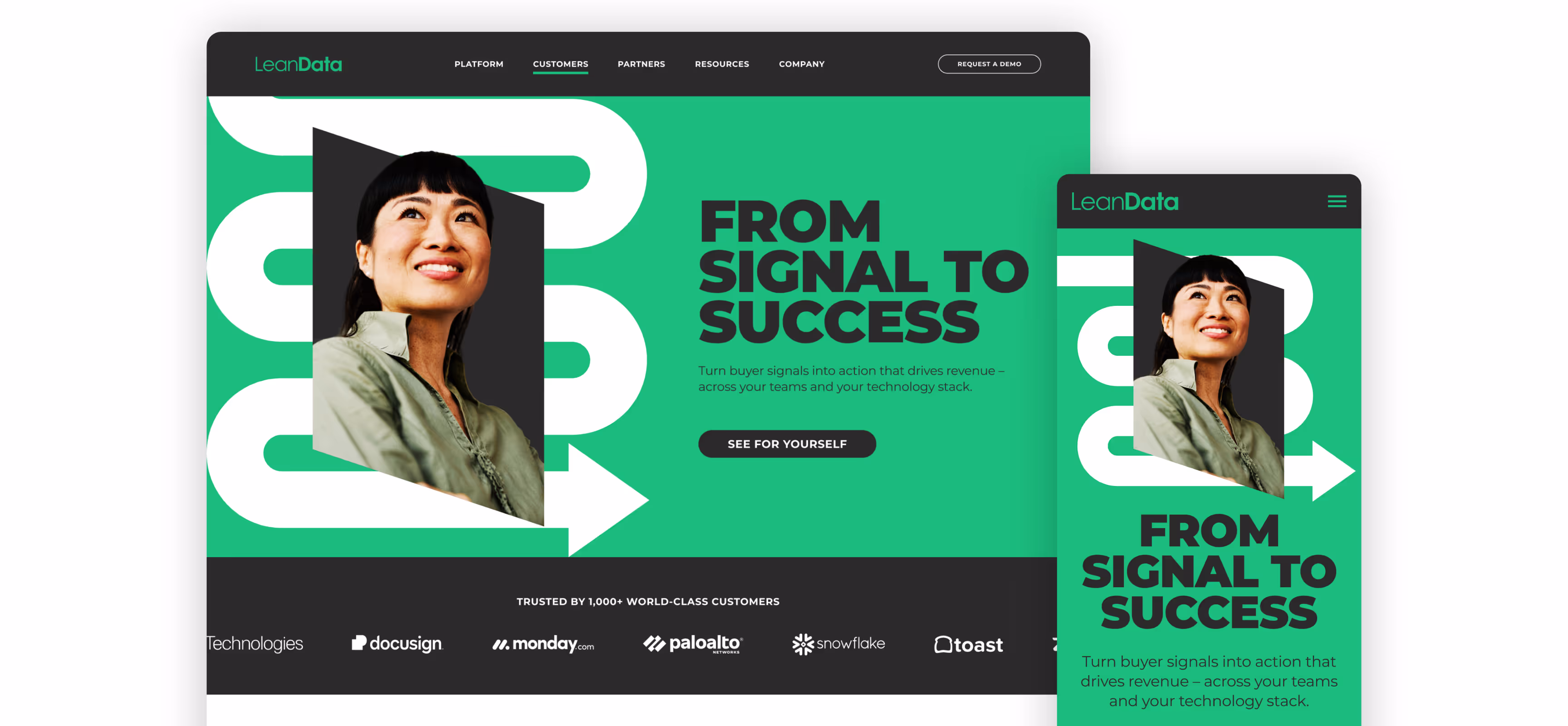
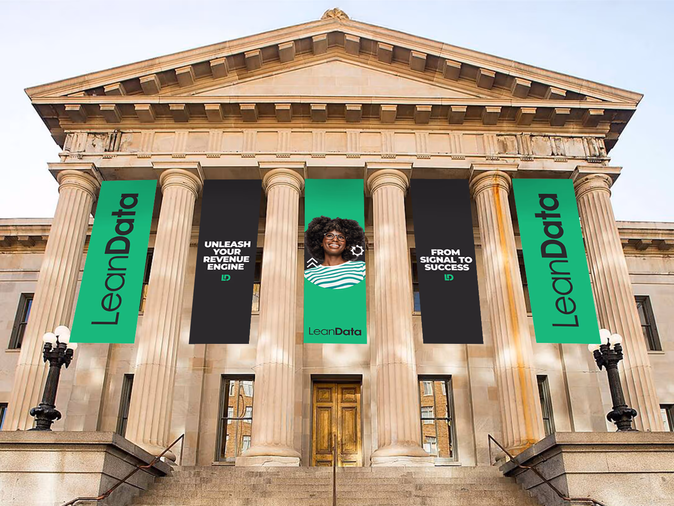
So Fresh and
So Lean

GOODS 

& LEANDATA

Project Type
Brand Refresh
Brand Identity

Services
Strategy & Vision
Design
Campaign
Production
Industry
Revenue Operations
LeanData, a powerhouse in Revenue Orchestration, found itself facing a critical disparity. While their platform was the gold standard, their brand identity had begun to lose its luster. In a crowded sector where everyone looks alike, they needed to shine. So, in close partnership with their internal teams,  Goods & Services helped find their new visual identity, one that actually reflected their superstar status.

Highlights

Refreshed the brand with bold impact and an ownable identity
Aligned the visual identity to the strategic messaging framework
Evolved the digital experience across desktop and mobile
Strategized the event space for the new brand’s debut at Dreamforce
Our Approach

What it Means to Be Lean

While we heard a lot from LeanData about what they do and how they do it, it wasn’t until we began our research that we saw their real impact. Revenue operations is one of the fastest growing industries, and some of the biggest players in Silicon Valley, from Snowflake to Palo Alto Networks, were trusting LeanData to optimize their go-to-market processes. We saw this sentiment in client testimonials, but also across message boards and online discussions. People saw real value in what LeanData provided and viewed them as a partner that could empower their processes to be smoother, faster, and more efficient. Not only was LeanData a rockstar, they had their clients feeling like ones as well.

We knew we had to inject that feeling into every aspect of the brand, without disrupting the equity they had already built. Our approach was built on the mantra "Evolution, not revolution”, honoring LeanData's core DNA while sharpening its strategic focus. We simplified their complex value proposition into a singular statement that would became the brand’s narrative backbone: "From Signal to Success".
The Execution

Designed for Impact

Once we had a firm grasp on the strategy and positioning, it was time to go to work. We started to evaluate the existing brand, beginning with the core elements of the identity.

We knew the logo needed a change, so we simplified it, paring it down to the most effective parts. We separated the logomark from the logotype, giving each it’s own place and purpose in the identity. Instead of competing against one another in the existing logo, they could each have their own time to shine in a broader identity.

We stripped down the logomark by removing the circle container and giving space to the letter forms for legibility, scalability, and visual impact. Both the mark and logotype were changed to one color to complement a refined color palette.

No longer would we choose between multiple shades of greens, blues, teals, and grays. A tweaked Lean Green was the new hero of the color palette: vibrant, expressive, and bold.
“I've had the privilege of working alongside an incredible team to bring this new LeanData to life. This comprehensive refresh represents our evolution and commitment to intelligent GTM orchestration.”
TARA MONTANEZ
LEANDATA PARTNER
When it came to type treatments, we knew we had to keep the same energy. In our goal of “evolution, not revolution,” we bumped up the headline weight for boldness and impact, set them in all caps, and tightened the letterspacing. Now, the typography now would match the brand personality and align with our messaging strategy through straightforward confidence and simple strength.
“We wanted the brand to reflect how users felt when using the product, unrivaled empowerment mixed with unwavering confidence.”
JOHN MEDZERIAN
CREATIVE Lead
After our research, we knew we wanted to specifically highlight an insight we uncovered: LeanData made people feel like heroes. Clients, after implementing LeanData solutions, created immediate impact  across their organizations. So, our new “hero imagery” was just that; expressive, people-first imagery that elevated everyday operations leaders into industry game-changers.
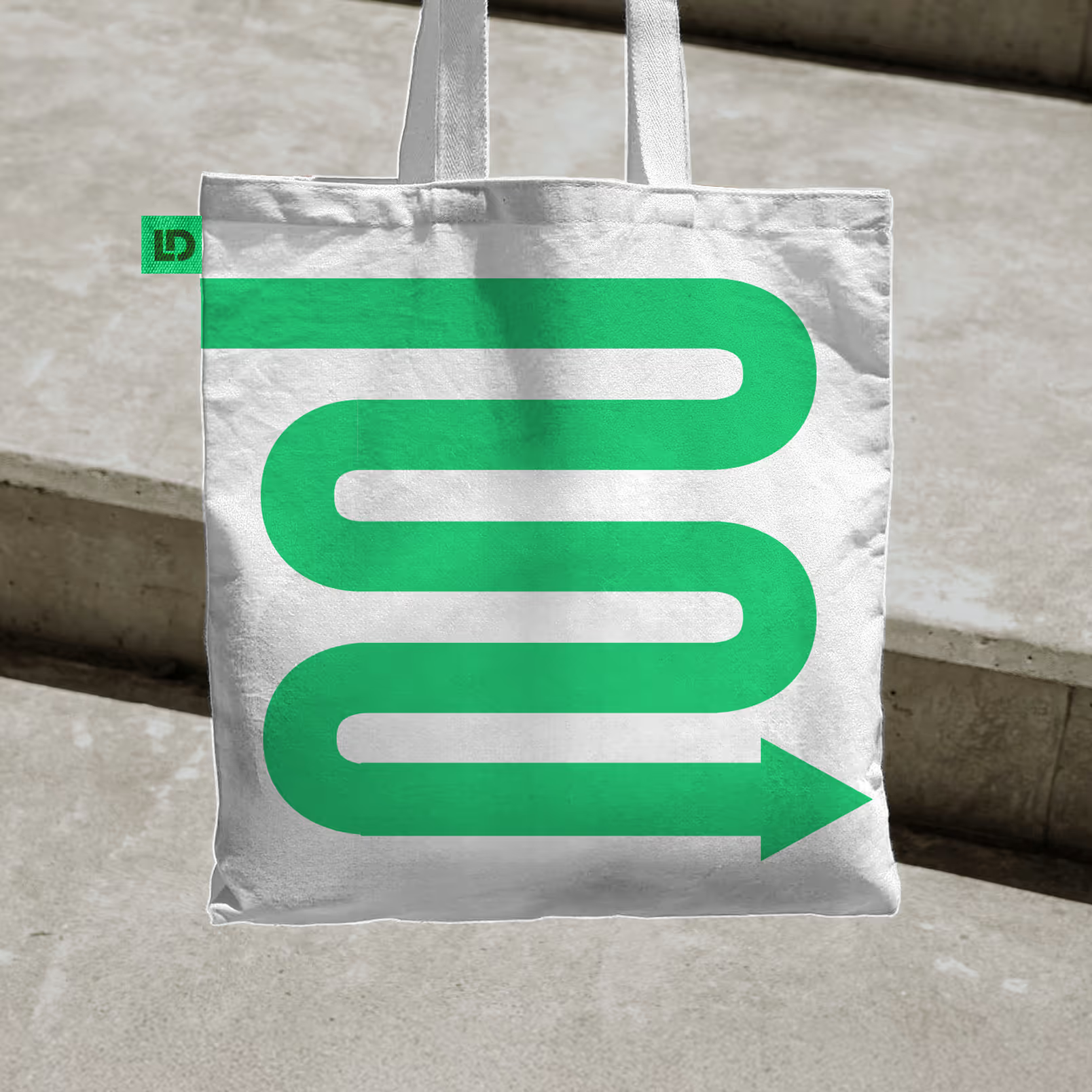
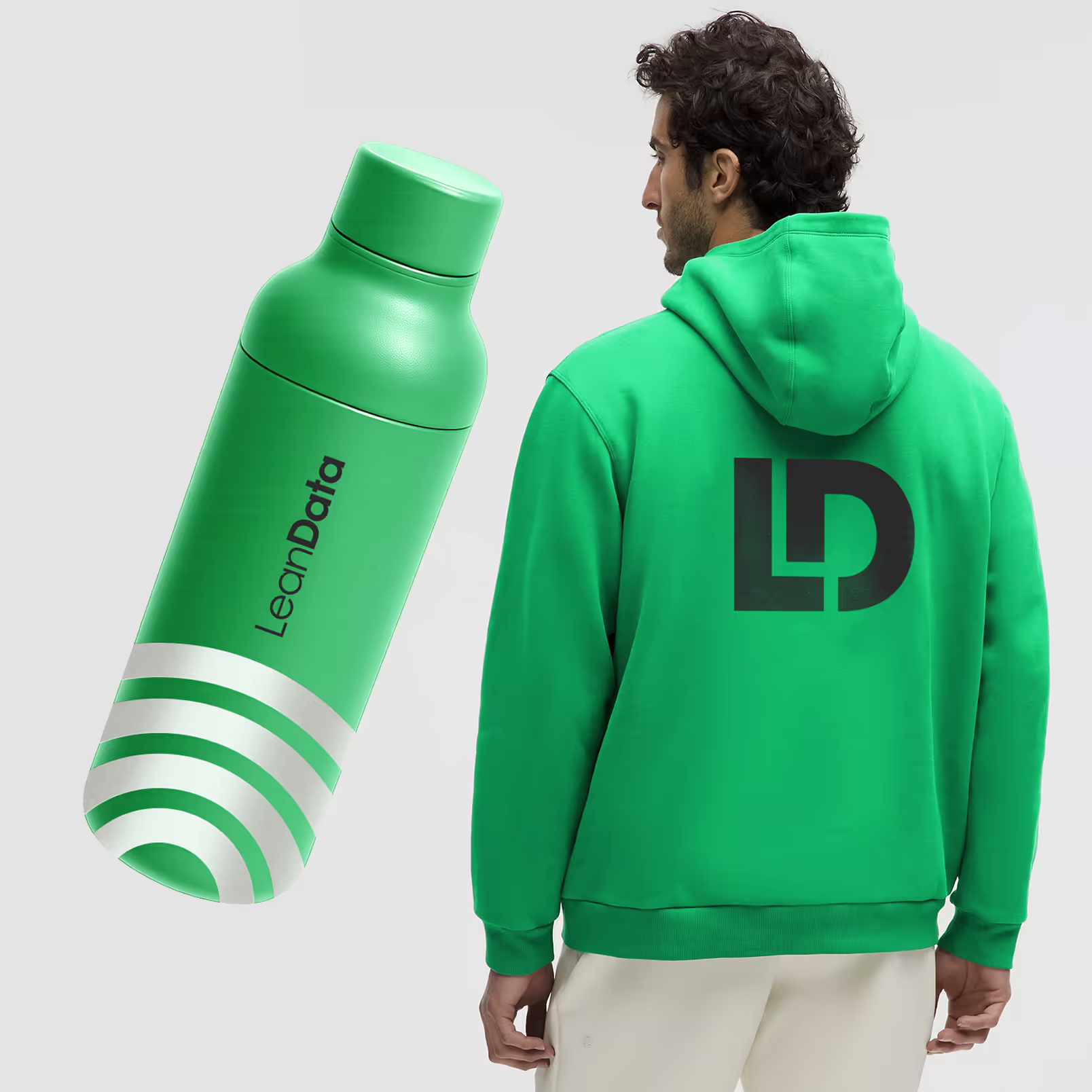
Alongside empowering portraits and impactful headlines, we developed and incorporated a bold icon library. These icons could be layered alongside the portraits or scaled to encompass the entire canvas. These icons helped to express LeanData’s value propositions and gave a dynamic energy to every brand execution.
Todd DiMatteo, owner and brewer of Good Word Brewing
These elements (and more) came together as part of a design system for a rapid visual reskin of the existing website. We created a kit of parts for the homepage and established patterns for Platform and Article pages in order to help bring the brand to life across the digital experience. The groundwork we laid also informed other digital assets from Zoom backgrounds to social media, ebooks, case studies, and sales presentations.
The Experience

It’s Go Time

With the foundation laid for the evolved LeanData brand, we had the opportunity to debut it on their biggest stage, OpsStars 2025. This event, happening during Dreamforce, was the perfect time and place to introduce the new LeanData, reaching the right audience directly.

We created a turnkey kit including exterior banners for the San Francisco Mint , custom banners for the LeanData Lounge, backlit signage, and takeaway print collateral. This established a high-impact, cohesive brand presence for the public debut.

From Signal to Swag

To ensure the brand's launch at OpsStars was instantly memorable and scalable, we designed a full line of custom merch that was as bold as the identity itself. We focused on turning iconic brand assets into tangible takeaways. This included sleek, custom water bottles, hoodies with the bold LD mark, as well as tote bags prominently showcasing the iconic buyer journey graphic.
The Result

A New Force in Revenue Orchestration

Alongside the LeanData team, Goods successfully launched a bold, modern, and high-impact identity. The new visual system is unique, recognizable, and own-able, aligning the brand's visual presence to its powerful strategic positioning. Anchored by high impact visuals, LeanData’s look and feel now matches the impact it has on its users. It’s more than just matching and routing, and now the brand reflects their true identity, the powerful intelligent revenue engine that drives GTM teams forward.
“While we've always been the orchestration powerhouse behind successful GTM teams, our new messaging, positioning, and design refresh finally matches the innovation we bring to intelligent revenue operations.”
TARA MONTANEZ
LEANDATA PARTNER
Next Project

The Cart of Seduction